Brand identity guidelines (2022)
Our logo helps to highlight the Industrial Estates of Esplugues de Llobregat (El Gall and Montesa) located in the city of Barcelona. The visual identity of this industrial park is expressed in a contextual and clear way to redefine its vision as an economic sector and inclusion that will stand out in the field of renewable energies and therefore a futuristic panorama is generated about what is to come for this area. We intend that the design of the brand attracts new entrepreneurs to install their companies in this industrial estate.
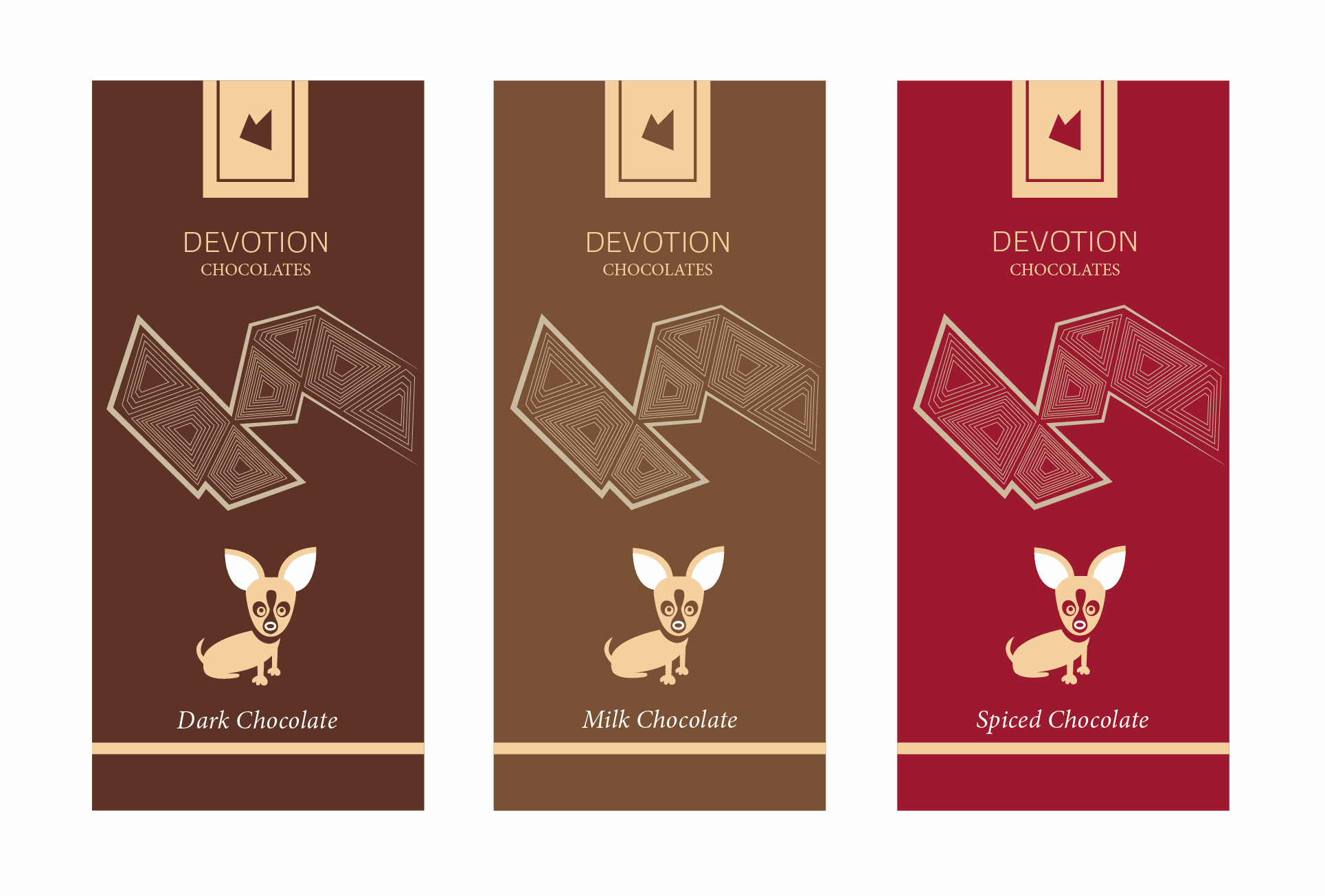
We carried out a unification of elements for the creation of a chocolate brand in Mexico with three different flavors. We did the design and the packaging tests (university project).
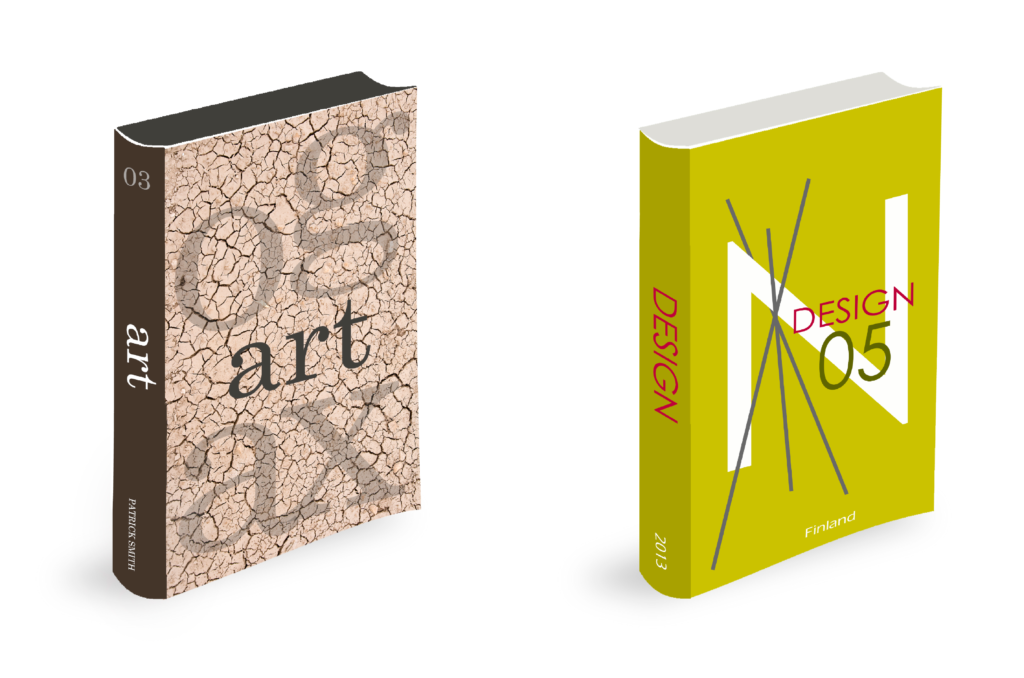
Editorial design (2013)
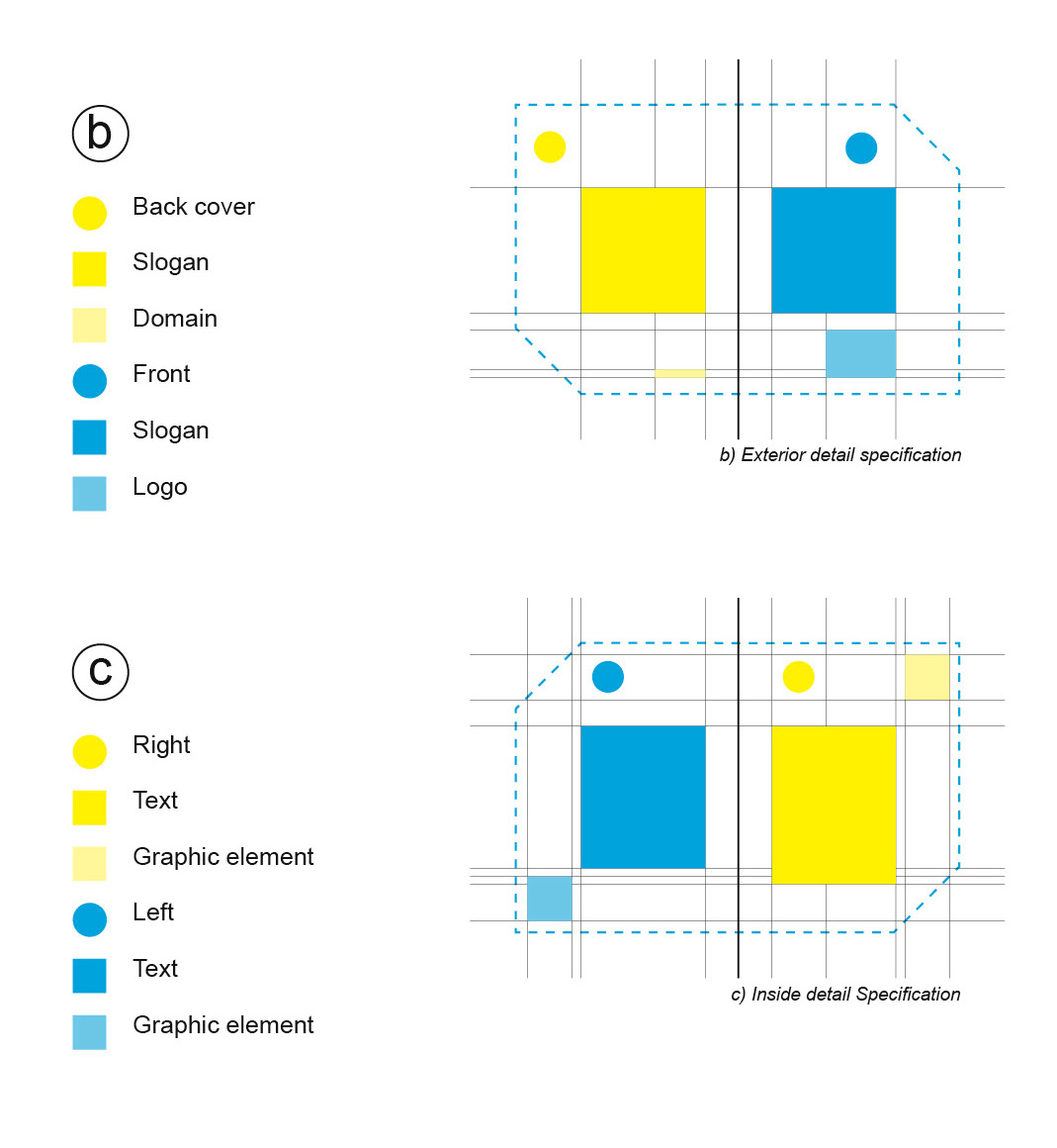
Proposal of design book covers, the objective of this project was the implementation of a color palette and the superposition of textures, geometric and typographic elements using photoshop digital tools.
Graphic Series 20th Century
University project (2021)
The Typographic Architecture takes a strong impulse during the 20th century, this generated that during that time line outstanding personalities emerged in continuous years, they invented the new visual forms within typographic and artistic contexts, promoting each one their style that would revolutionize and mark the new tendencies.
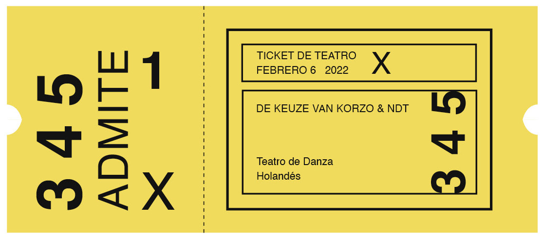
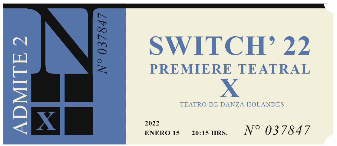
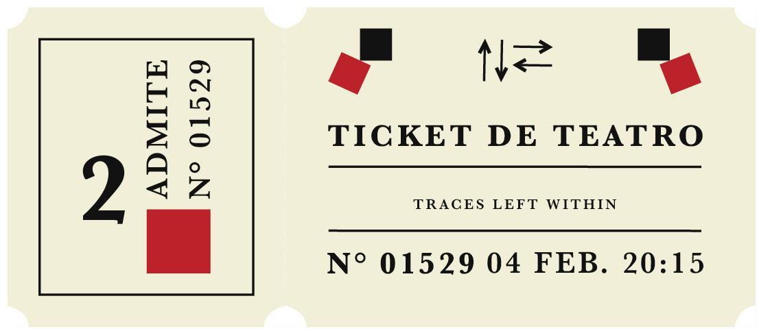
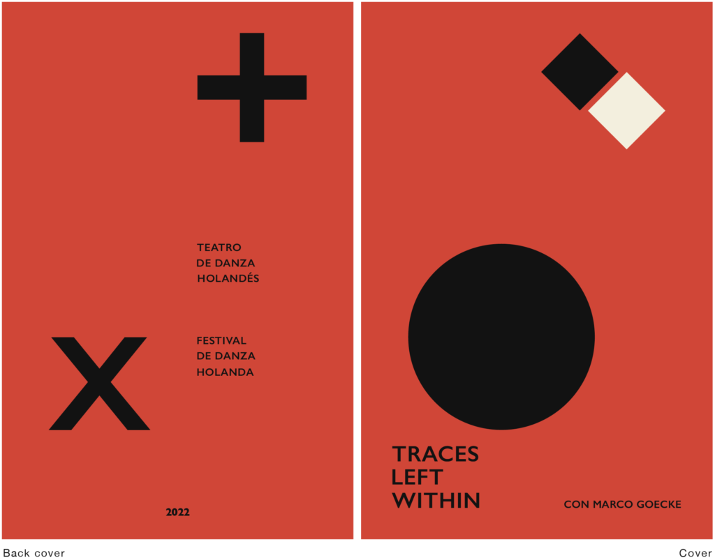
This experimental process aims to make use of a correlation between these characters from different eras, extracting the essence of their trends within the design processes but also a database was taken on the cultural projection in the Holland Dance Festival category of Nederlands Dans Theater, the performance dates within the new graphic series designs were real. It was also proposed to merge the dance notation system, such as graphic elements that helped to personalize the context of each proposal.
| Typeface: Helvetica Games: Figure-ground Inspiration source (trend): Adrian Frutiger Graphic series: Informative poster Graphic format: A3 Concept reference year: 1950 Cultural Category: Dance Festival Cultural Company: Nederlands Dans Theater Relationship: Synergistic System: Dance Notation System | Typeface: Times New R. Games: Plane movement Inspiration source (trend): Alexey Bro. Graphic series: Informative poster Graphic format: A3 Concept reference year: 1930 Cultural Category: Dance Festival Cultural Company: Nederlands Dans Theater Relationship: Synergistic System: Dance Notation System | Typeface: Futura Games: Checkers Inspiration source (trend): Herbert Bayer Graphic series: Informative poster Graphic format: A3 Concept reference year: 1920 Cultural Category: Dance Festival Cultural Company: Nederlands Dans Theater Relationship: Synergistic System: Dance Notation System |
Ticket design
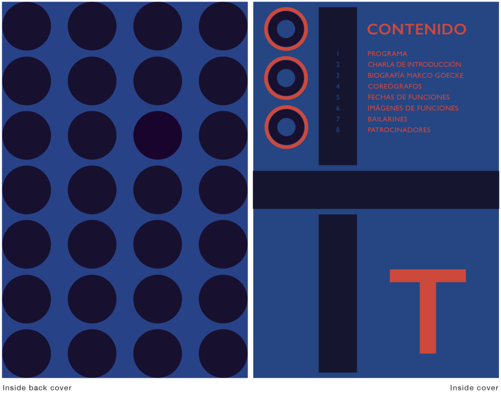
Informative dossier
Puertas Abiertas (2022)
Our brand and identity design helps to highlight the values about the labor inclusion of people with limited intelligence quotient, it collaborates in the importance of how these individuals fit and contribute to society. The name “Puertas Abiertas” is an initiative that allows this group with different skills to have access to equal employment opportunities.
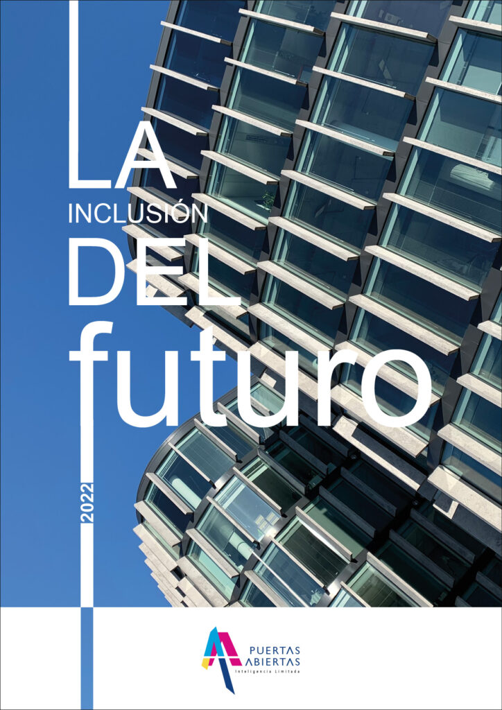
Master’s thesis cover about digital design and advertising campaign, the photograph was taken in Warsaw, Poland and its a staging that conceptualizes the modern, the work environment and future through topography and image.
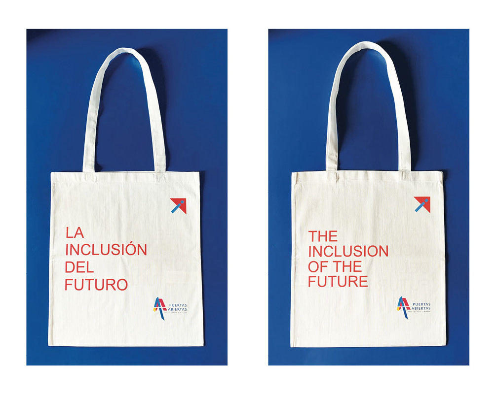
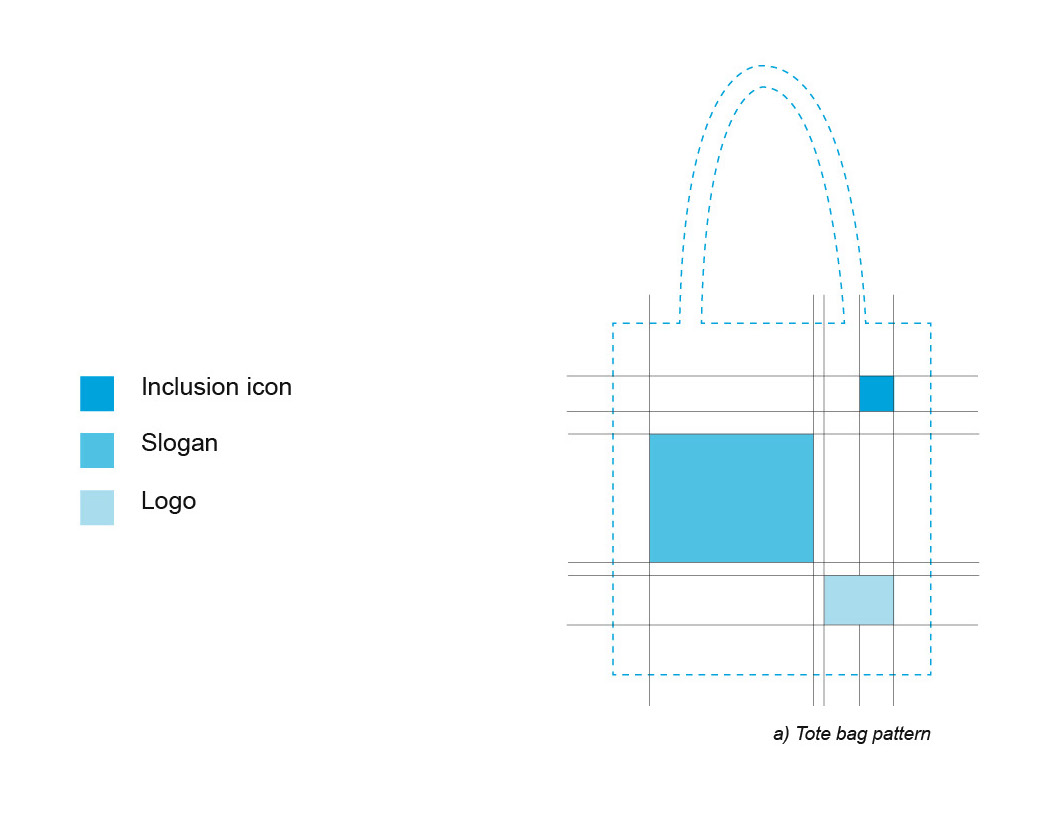
Tote bag design and its pattern the front and back cover were made-up in two different languages Spanish and English including the logo of the master’s thesis, slogan and our own inclusion icon for the whole project which represents a person accessing the laboral sector.
Room layout of the launch event

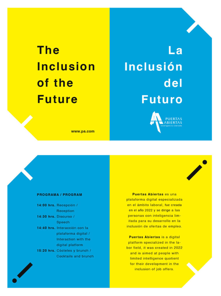
Informative dossier layout about the program within the launch event of the advertising campaign and the digital platform of the master’s thesis.
